If you happen to have any comments on these new designs, please leave them!
I may form a small team of people to whittle down these designs into a final set of 1-3 logos. Please leave a comment if you’d be interested in being part of that team and have some time in the next few days. Or perhaps the feedback will be concrete enough for us to proceed; let’s see what the comments bring.
UPDATE: Thanks to our friend Nicolas at Monkeydo.digital
Addressing the first page, I prefer the simplicity of the top right, though in general I think I prefer to have the orange on the right. I also would prefer flat shading rather than a gradient and to see the saturation dialed down. Saturation more akin to our current colors would distract the eye less while browsing, I think.
As to the shape of the brain, I have a slight preference for the sharper lines of the chainsaw brain, as it seems to match the sharp angles of the hexagon better. Others have expressed a preference for the rounded lines, but I wonder if a middle ground could be found. Additionally, while the rounded shape seems fairly reasonable, it stops saying “brain” to me when the symmetry is added in. I think this could be improved a great deal by hewing more closely to the shape of the brain: thicker toward the rear, tapering slightly moving forward, and with a slight rounded separation of the lobes in the front.
As far as fonts go, I think the Roboto is my favorite, though I’m not sure I like the weighting effect. I think I have a slight preference for having the text on both sides of the image.
Top left is my pick (rounded brain). As far as fonts go, I think the Roboto is also my favorite 😉
Nice stuff! Love the colours!!
The Meta Brainz mirrored brain looks fantastic, even at a smaller size. I don’t particularly think it’s important to have it be super obviously a brain – it’ll usually be paired with the text anyway, right?
The only font there that doesn’t hurt me is Roboto, with no weighting effects – I think since the logo has quite a bit going on, it’s too much to try ‘do something’ with the font as well. Maybe Advent Pro if the weighting on the ‘A’ is fixed.
Anyway, looks like it’s getting there? The last three make a nice family as well.
But got to add – I still think the just plain old solid coloured ‘halved hexagon’ is super sexy 😛
I agree with leftmostcat about finding a middle ground in angle sharpness. Maybe remove grooves around the brain but keep borders sharp?
My favourite font from ones in the document is Roboto. Though, I’m not a fan of changing font weight. That part feels unnecessary.
Logos for CritiqueBrainz and Picard look nice. I think text under “Picard” should be something like “for MusicBrainz”.
I agree re: colours. they look to saturated. these logos with the existing mb colour scheme would be a nice thing to see.
I feel like posting this is pointless, since it seems like you’ve already decided what you want the logo to be, but…
The hexagons make me think of Ingress, not MetaBrainz…
I’m sad to see no purple. 🙁 However, I do appreciate the bright bold colours (unlike the people above, it seems). The MetaBrainz ones, particularly the green and orange, seem much brighter and fresher, which is a huge improvement over the current colours which bring to mind mould, zombies and radioactivity, which was probably not what we were aiming for at the time. 😛
The MusicBrainz, AcousticBrainz, CritiqueBrainz and Picard logos really don’t work for me at all. They look like we’re trying to force two unrelated things together. It’s like one of those things where you match the left side of one face with the right side of another (or the top half of one body with the bottom half of another body) and the result clearly doesn’t match. The two halves having different colours only makes that effect worse.
In general, the logos feel too complicated to me, like you’re trying to put too many different concepts into a single image and like you can’t get away from the idea that the logo has to represent the name as closely as possible rather than simply being a recognisable symbol of the project. I mean, try and describe the MusicBrainz one in words. My attempt would be something like: A hexagon split in two where the left half is dark pink with a white outline of the left half of a music note and the right half is orange with a white outline of the right side of a brain. If you look at many other sites though, they almost all have much simpler logos. The most complicated I can think of is Wikipedia, but even that is easy to describe: An incomplete white sphere jigsaw with a letter on each piece. Or how about Wikidata: A red, green and blue barcode. Discogs: The word “Discogs” in black with the “o” replaced with a record. Twitter: A light blue flying bird. WorldCat: Five different coloured (yellow, green, blue, purple and dark pink) curved lines in a circle.
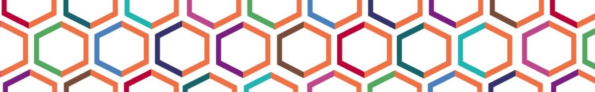
If it were me, I would simplify it even more. As I said, the two mismatched halves don’t work for me, so I would use the same image across both sides of the hexagon. e.g. Keep the brain for MetaBrainz and change the image inside the hexagon for other sites (probably keeping the colours the same for more consistency), or use the brain for every site and vary the colours. However, I still think a brain is a gross and ugly logo to have (I suspect the name is already bad enough for some people), so I’d probably go a step further and remove the brain outline and just keep the neural networky thing in a hexagon shape. I also feel like there’s still too many different colours (I counted 11: dark pink/mulberry, magenta, orange, light/yellow orange, green, lime green, blue, light blue, teal, cyan and pink) which doesn’t really make it seem like a consistent brand to me, we’re only a couple of colours short of a full rainbow.
I like that the fonts seem less… big… I’m not sure how to explain that, I think it’s just that the current font we use has very thick letters, very rounded shapes and even sloping sides for the “M”, which make it seem very bulky.
Slightly more detailed comments on the individual pages:
Page 1:
Top left: I guess out of all of the ones on the page, the left side and the right side are the ones I dislike the least (I almost like the right side, but it’s still a brain). I still don’t think they go together though, and since the right side is bigger and busier than the left, it feels unbalanced (right-heavy, not top-heavy).
Top right: For me, orange on dark pink doesn’t work and dark pink on orange doesn’t work. It might work with a thin white outline, but not with the colours directly next to each other. I’m not sure if it’s just lack of contrast or what. The music note appears to just be a completely standard one from a font cut in half and the random orange pixels around the edge of the curved line looks like someone used the bucket tool, so this one comes across as amateurish to me.
Middle: The border on the right reminds me of 90s-style bevelled images.
Bottom left: The irregular border looks like some sort of SVG conversion gone wrong, I don’t like the gradient, the weird lava sea thing (I guess what leftmostcat means by chainsaw) is odd and the dropshadow on it seems out of place somehow. The lack of a line down the middle only reinforces that the two halves don’t actually belong together. I prefer the note head from the top row, because this one looks like someone stabbed it with a needle. The music note is also too magenta for my liking. In general, it’s just too busy.
Bottom right: See what I said for the bottom left. Although some of the things which made the bottom left one look too busy to me, the border here makes it look busy instead.
Page 2:
I really dislike the hexagon in the middle of the word. Not only is it gigantic in comparison to the text (about three times as tall?), it makes the names look like two words when they’re not (it’s bad enough that people can’t capitalise the name properly without also making them think they should put a space in it). Also, since the words are different lengths, it’s not even in the middle.
I also really dislike the font weight changing. The impressions it gives me are: The font is badly designed because it has some letters thicker than others, my eyes are going weird, the letters are all mismatched. Having one half be bold and the other not might work, but a gradient of font weights like that really doesn’t work for me.
I don’t like the dropshadows on the second one nor do I like the font, the letters look all mismatched. The “I” has a random serif, the “C” and “S” are bigger at the bottom than the top, the “R” is bigger at the top than the bottom…
Page 3:
See page 2 about changing font weights.
Top: Having the two halves offset might work and it looks fairly OK, but it seems completely random and doesn’t seem to add anything.
There’s also no example of this font without the font weight gradient, it seems, so I can’t really compare it to the other fonts.
Middle: It’s a hexagon! Not sure what this is doing here.
Bottom left: I really don’t like this font. Aside from that, if you’re going to use the dot of the “i” like that, surely you make it a dual-coloured hexagon. Missed opportunities! 😛
Bottom right: The hexagon looks far too small compared to the text. The text reminds me of something else, another site I assume, but I can’t think what right now.
Page 4:
The text looks much better now that the font weight gradient has been ditched. The font is OK I guess. I think I prefer sharper cleaner edges over rounded ones like here.
Top, middle: See page 2 for the hexagon in the middle of the word and the font size.
Bottom: The hexagon looks too big compared to the text.
Page 5:
See page 4. I still don’t like the font, although ditching the font weight gradient improves it a lot (didn’t realise until I saw the random serif on the “I” that it was the same font).
Page 6:
See page 4. I quite like the font, although it still reminds me of something else.
Page 7:
See page 2 and 4.
I’m not sure why the bars for AcousticBrainz have snow on the top.
The speech bubble for CritiqueBrainz and the the tag for Picard look pretty tacky to me, like they came from some clip art collection, they don’t seem to match the style of the other hexagon halves. I guess because there’s a lot more white on the other halves.
Some random comments from me:
* Advent Pro is ugly to my eyes (sorry). I think I like Jura most of the fonts shown, but the others are OK as long as it’s not Advent Pro. 😉
* Regarding the logo variations on the first page, the lower left one gives me a strong 3D impression due to the varying-width border, as if it were a cube with one vertical edge in the foreground. However, the note/brain halves are not in perspective; they still look 2D. Together, this causes visual confusion.
* The brain in the upper right version on page 1 is closest to a brainy appearance, but still not unambiguous. The lower ones I’m not sure I’d associate with a brain.
* The font-weight gradient is somewhat OK in the large versions, e.g. those on page 7, but in small versions it looks odd.
* The bubble as the identifying part for CritiqueBrainz … there must be something better?
chirlu: I suggested thumbs up/thumbs down for CritiqueBrainz. I’ll ask why this didn’t appear in this rev…
Are the fonts only for the logos or the entire site? In the latter case, do all of these fonts support all unicode characters? I wouldn’t be surprised if there are plenty of releases with all sorts of weird characters and it would be a shame if a different-looking fallback font would have to be used for those.
I prefer the variants that are mostly flat, i.e. without any weird gradients/bevels/shadows/borders that distract from the basic shapes, which are already busy enough. I’d be happy if the logo was entirely flat.
I see how “MUSIC” and “BRAINZ” are paired with their halves of the logo. Like Nikki said, MusicBrainz is one word…this looks as weird as FIRE [logo] FOX or GIT [logo] HUB would.
I think it’d be nice to see some variants that don’t have the brain stuff on the right halves (excluding the MetaBrainz ones), i.e. just have the icons completed and centered. The split hexagons seem thematic enough on their own and probably don’t need the forced brain imagery to tie things together. Actually, the split hexagons remind me of the left/right sides of a brain already. 🙂
When I first saw the logos, I was thinking the same as nikki. A logo should be simple and if you can’t make it look good in black and white, you will have problems using it. The logos look nice, but there are too many details and too many colors. I’d suggest to try working with the small one in the middle of the first page.
Some time ago I had an idea to use a note like this as a MB logo. It’s probably not what you are looking for and it’s not universally usable for other MeB projects, but here is it: https://www.flickr.com/photos/lukasl/17259764342/ (sorry for the quick drawing)
I’m not sure if my previous comment here got lost, but anyway – here is a quick drawing of an idea for MB logo I had a few years ago. https://www.flickr.com/photos/lukasl/17259764342/
IMO, …
A good logo should be based on a simple, memorable shape. Color, if any, should be secondary. These are much too complicated. I get that there should be a common theme. I would think about basing them all on a simple, bold, stylized, lowercase b for brainz (and, perhaps, metabrainz). Other would be formed by simple decoration. For musicbrainz, the b would be a solid musical note. Picard might invert the signature b into a p, perhaps with a tag shape in the opening or on the “note”. Critiquebrainz might have the b looks like a thumbs up.
… two triangles on the stem of the b (like diamonds on the back of a snake) could suggest m for music or meta
Of the logos on the first page, the upper left and lower right ones are my preferences. I like the flat look, and the outlining on the note seems just right to me. On the lower left one, the slightly different-colored square in the background on either side is kind of weird, it just makes things look more cluttered. The top right one looks sort of bland; I think the outlining on the note really just appeals to me.
For fonts, it sounds like there’s a lot of support for Roboto Condensed, and that one looks fine to me. Advent Pro is my least favorite. Jura looks kind of neat, but would need a heavy weight. Exo doesn’t have enough samples to really get an opinion. I definitely don’t like the font-weight gradient. At most, maybe a different weight on either side of the central graphic logo could work, but adjacent characters should have the same weight.
Overall, I really like the logos, and I think the right combination of the bits and pieces here will make a really great logo.
Lukas: So, you’re basically saying we should use the Betas Music logo? http://www.beatsmusic.com/ Not that they will be using it for much longer. 🙂
Well, it seems that I did not do my research properly. 🙂
Coming back to this after a few sleeps, although I love the brain work that’s been happening in the logo, it doesn’t quite sit right with me. Not because I don’t like the imagery, but because the complexity doesn’t reflect MB’s function, which is very basic stripped down functionality – very dev focused, easy to plug into other services, something to license out rather than a competing service or ‘business’ etc. The logo direction at the moment doesn’t reflect this in my opinion.
This is more what I would associate with MB:
http://www.simonhartman.com/images/MB mockup 15-04-28.jpg
The bevelled edges are a bit on the nose sorry! But hopefully you get the gist
Let’s do this url instead 🙂
[img]http://www.simonhartman.com/images/MB_mockup_15-04-28.jpg[/img]
whatever > >
Simon: Very interesting — I like the simplicity of this. Maybe there are “layers” of logos with different levels of detail. When the logo is big, full detail, medium, reduced detail and small, nothing but the hexagon. Hmmm. What do you think?
I was wondering about that too, could work out. Although I can’t imagine you guys using the detailed versions that much! The ‘brainz’ services don’t really use many (any?) graphics just for the sake of it! Your designer has already come up with heaps of useable stuff if you’re going that way.
I guess the main thing, for me, about the split hexagon is that it already represents a digitized brain, especially when paired with the ‘brainz’ text…
hi i like the bottom left with the jura font, if you need any help with logos or any graphic design or web design then check me out at puddesign.com and i would be happy to help