

Making sense of the data
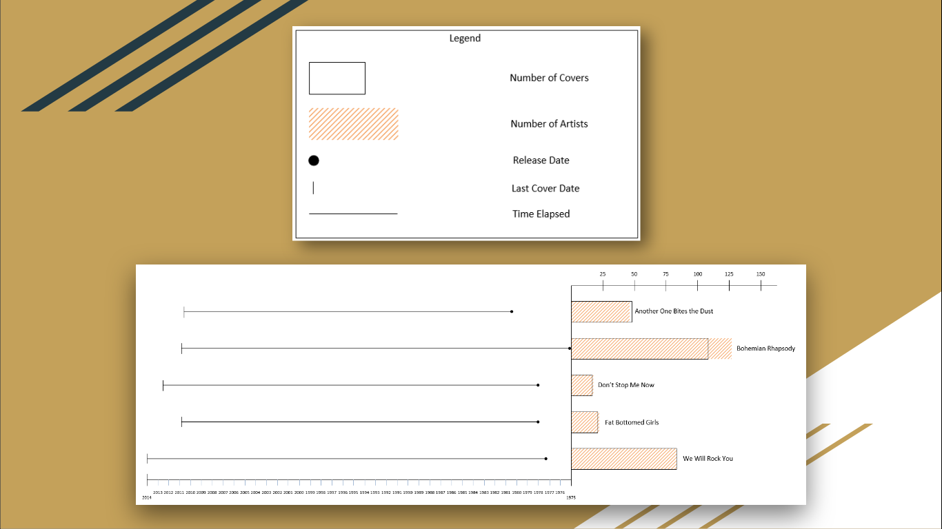
A few explanations are necessary for some of the data, especially the difference in number of covers and number of artists. Don’t Stop Me Now, Fat Bottomed Girls, and We Will Rock You had the same number of recorded covers as number of artists who have covered the song. Why were Another One Bites the Dust and Bohemian Rhapsody different? As it turns out, Another One Bites the Dust had more covers than the number of artists who have covered the song. This happens because some artists have covered the song twice (e.g. once on a studio release and another on a live recording release). On the other hand, Bohemian Rhapsody had more artists covering it than number of covers because some recordings featured multiple artists on the same cover (e.g. the 1992 live performance with Elton John and Axl Rose). The data opens many interesting questions. Why have some songs persisted longer than others (in terms of recent covers)? Have these songs impacted culture and society in different ways? How have they permeated culture? Is there geographical bias in the data? This exercise was an exploratory assignment, but we had fun visualizing it and ended up learning an interesting pattern in music data.Check out the presentation and paper
If you’re interested for the full details, the slides and a short paper about the presentation are available online. They provide deeper context for the research and the visualization details based on different design concepts. You can see what else David Kim, Jathan Anandham, Justin W. Flory, and Scott Tinker are up to on LinkedIn. Thanks for tuning in to this adventure into music data analysis, powered by MusicBrainz!Photo by Matthias Wagner on Unsplash.
Making graphs is easy. Making intuitive, easy-to-understand graphs? It’s harder than most people think. At the Rochester Institute of Technology, the ISTE-260 (Designing the User Experience) course teaches the language of design to IT students. For an introductory exercise in the class, students are tasked to visualize any set of data they desire. Students David Kim, Jathan Anandham, Justin W. Flory, and Scott Tinker used the MusicBrainz database to look at how five different Queen songs went mainstream in different ways.Five factors of Queen
Our mini data science experiment decided to look at five unique data points available to us via MusicBrainz Works:- Number of recorded covers
- Number of artists who covered a song
- Release year
- Year of last recorded cover
- Time elapsed between release year and year of last recorded cover
Making sense of the data
A few explanations are necessary for some of the data, especially the difference in number of covers and number of artists. Don’t Stop Me Now, Fat Bottomed Girls, and We Will Rock You had the same number of recorded covers as number of artists who have covered the song. Why were Another One Bites the Dust and Bohemian Rhapsody different? As it turns out, Another One Bites the Dust had more covers than the number of artists who have covered the song. This happens because some artists have covered the song twice (e.g. once on a studio release and another on a live recording release). On the other hand, Bohemian Rhapsody had more artists covering it than number of covers because some recordings featured multiple artists on the same cover (e.g. the 1992 live performance with Elton John and Axl Rose). The data opens many interesting questions. Why have some songs persisted longer than others (in terms of recent covers)? Have these songs impacted culture and society in different ways? How have they permeated culture? Is there geographical bias in the data? This exercise was an exploratory assignment, but we had fun visualizing it and ended up learning an interesting pattern in music data.Check out the presentation and paper
If you’re interested for the full details, the slides and a short paper about the presentation are available online. They provide deeper context for the research and the visualization details based on different design concepts. You can see what else David Kim, Jathan Anandham, Justin W. Flory, and Scott Tinker are up to on LinkedIn. Thanks for tuning in to this adventure into music data analysis, powered by MusicBrainz!Photo by Matthias Wagner on Unsplash.
This is really neat!
One thing I would have liked to see on the timeline graph/line would be maybe smaller vertical lines for all the covers/recordings, to make it visually apparent the distribution of these. Were all the covers made soon after the initial release and then fading off? Were there a few years that the covers were from and then they generally died out? Did the track live in “obscurity” for a while and then suddenly later got picked up by cover artists?
Of course, there are always more questions to explore. This is a really nice “door opener” for some of them. 🙂
We had a round of feedback in the course too. In retrospect, the years should be ordered left to right, not right to left like they are now. We also wanted to use greater averages for years, maybe using five year intervals at a time so they’re easier to read on the x-axis. And maybe a dot plot would be better for each year there is a cover, instead of a solid line. 😀 I hadn’t thought of that. We also thought it would be cool to personalize some of the bars with visual indicators for what they mean (e.g. music-related icons and images in background).
Glad you liked it! Thanks for encouraging me to write the blog post. 😉
How did you access the data from the works database: Number of recorded covers, Number of artists who covered a song, Release year, Year of last recorded cover, Time elapsed between release year and year of last recorded cover? I am using the following method in my Python code: musicbrainzngs.get_work_by_id(id, includes=[]). But the only data I am getting is ‘type’ ‘title’ and other identifying information, not cover data like you used. What methods did you use/how did you access that data?
I wish I had a more exciting answer. Unfortunately, we did this by hand for the purposes of our assignment since we had a few days to complete it. I suggest asking for guidance in the #musicbrainz IRC channel for tips on how you might be able to do this in code.